

Australia’s largest ports logistics company wanted a design rebirth. The rules: reflect the tradition of the P&O brand, retain the traditional blue and yellow, but create an image of independent strength, reliability and dynamism.
Juice found the answer in Port Logistics itself, forging an arrow from the P and L. Perfectly contained, yet ever-moving, it is both an nod to the mechanical realities of cargo handling and the promise of effortless completion.
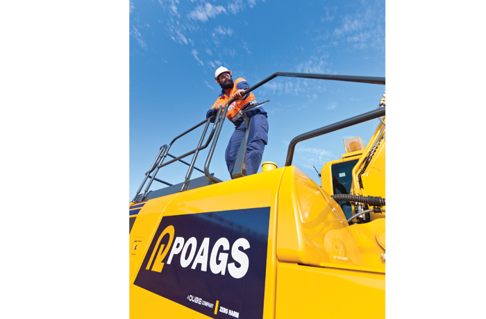
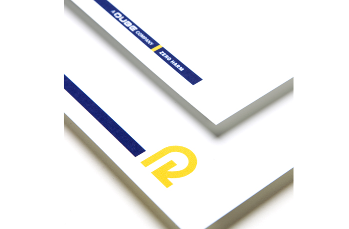
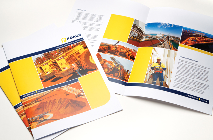
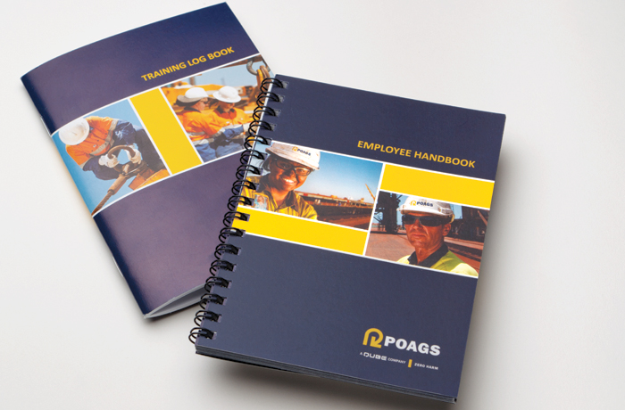
Now implemented Australia-wide, the POAGS brand identity system provides seamless graphic continuity from business cards to Bulk Materials Shiploaders.