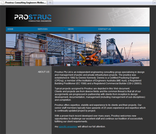
Prostruc wanted a website but, before they could do that, they needed an identity. One that managed to combine their expertise in both structural engineering and project management, and that presented them as solid and reliable but not old-fashioned or unimaginative.
So Juice engineered the perfect logo: the solid weight of the capitals enlivened by rounding; the two spheres of speciality made plain in colour; and the whole word strongly reinforced by a typographical support beam running right through it.


