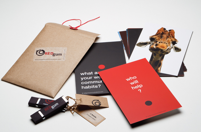
Can a training company escape the stereotypes of the hard sell? Can a corporate communications specialist project an image of down-to-earth friendliness and approachability? Can professional livery be fun?
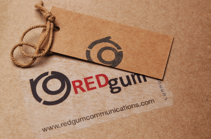
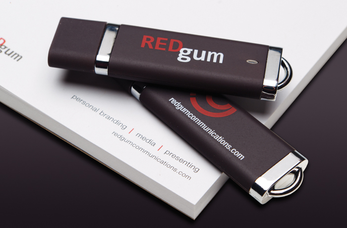
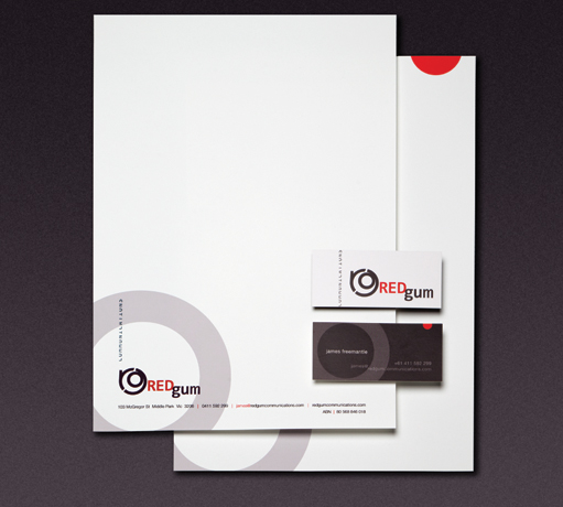
Juice found the tree in the name, and cross-sectioned a brand mark for REDgum Communications that speaks of years of accumulated wisdom. Solid, dependable yet quite charming, it’s a logo both utterly sophisticated and completely unpretentious.
The visual identity extends this playful thinking in earthy brown envelopes, packing twine, button fastenings and brown card swing tags. This is a company you know you’ll like.